This eyewear and spatial-computing accessories brand needed an international storefront that explained its products through imagery, use cases and feature content. Brand presentation, product research and purchasing needed to share a consistent visual and interaction system.
The client’s in-house team had already produced the visual designs, including page layouts, component styles and interaction requirements. Our role was to turn those designs into working pages and address the different space available for images, copy, navigation and purchase controls on desktop and mobile.
We reviewed the implementation scope, developed pages and shared components, implemented responsive behavior and completed launch testing. The client supplied the visual design. Spatial computing and multi-window experiences are features of the client’s products; our delivery was the website content and interactions presenting them.
The challenges
Designs need working implementation
Implement layouts, component styles and interactions across the site, extending beyond a static hero section.
Layouts need to adapt to different screen sizes
Check images, long copy, purchase controls and navigation across mobile and desktop layouts.
Accurate design and usable interactions
Campaign, product and help pages must match the designs and support their intended tasks.
02Our scope of work
Design review and implementation planning
Review the client’s layouts, typography, components and interaction states page by page. Identify shared navigation, content and product structures, and establish the implementation scope and responsive requirements for development and acceptance.
DeliverableImplementation scope and component plan
Pages and shared components
Turn the approved designs into working page structures, styles and interactions, with consistent navigation, cards and content modules. Implement product and use-case pages under the client’s established visual guidelines.
DeliverableWorking website pages
Desktop and mobile adaptation
Adapt image proportions, long copy, navigation and product controls to different screen sizes. Implement the specified interactions and check content browsing and purchasing actions across devices.
DeliverableResponsive layouts and interactions
Design checks and launch
Compare visual output and component states with the client’s designs, then test navigation, content and product journeys. Resolve review feedback and complete cross-device testing, acceptance and launch.
DeliverableVerified website release
03Pages, features and journeys
Project interface
01
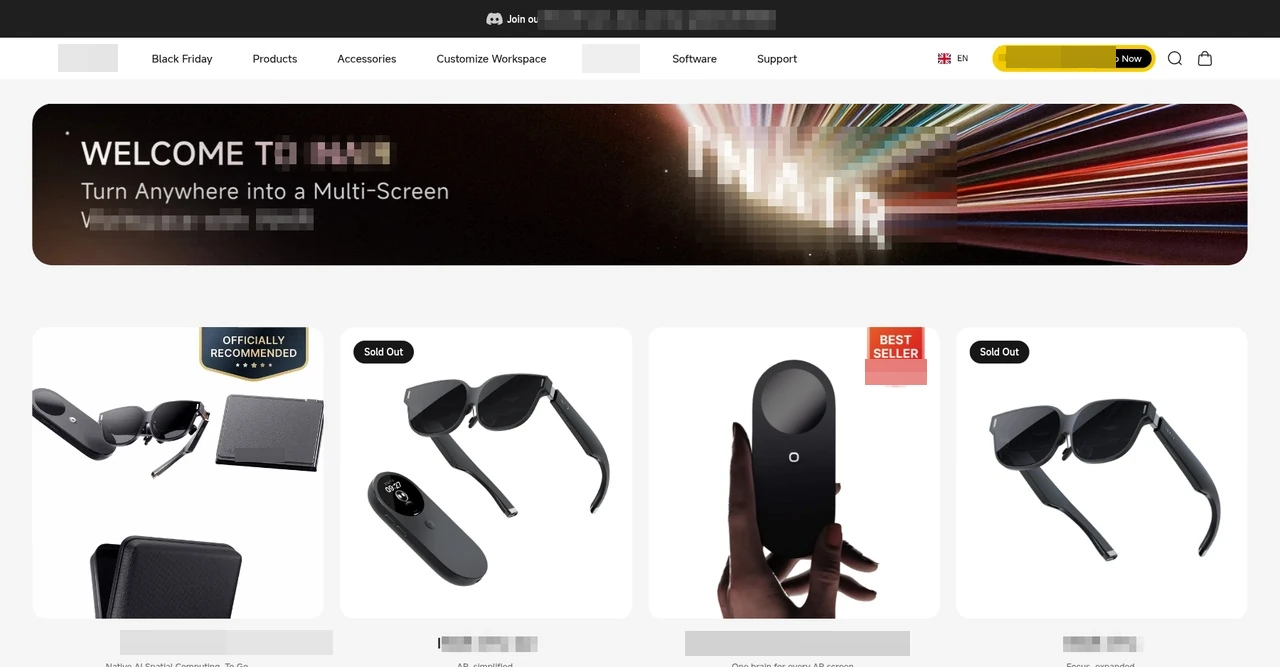
Translate the supplied design into a campaign homepage
The campaign homepage brings the hero visual, promotion, navigation and shopping entry together in one page. Development followed the client-supplied design, with attention to image proportions, type hierarchy, component placement and consistency across the site.
The supplied design guided page and component implementation.
Campaign messaging and shopping actions use one visual system.
Project interface
02
Carry the design system into product browsing
The collection connects a campaign banner with a product grid containing imagery, status labels and product information. Implementation addressed both visual fidelity and the way different images and product states fit within a consistent layout.
The banner and product grid create a continuous browsing path.
Card styling accommodates both product imagery and status information.
Project interface
03
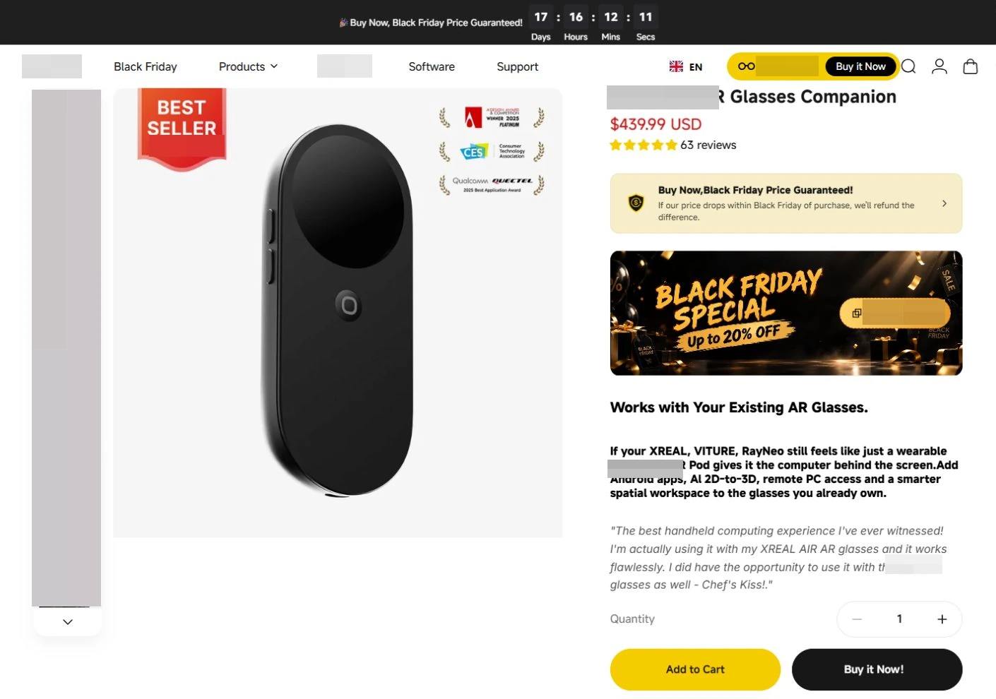
Keep purchase actions clear and usable
Quantity controls, add-to-cart and purchase buttons form a defined action area on the product page. Implementation and responsive checks cover both placement and interaction so visitors can continue from product research into purchasing.
Keep purchase controls clearly connected with product information.
Include key purchase actions in cross-device checks.
Project interface
04
Carry the site experience into support content
Support pages follow the site’s visual conventions and content hierarchy for compatibility, product selection and usage information. Implementing the client’s designs keeps product research and support content consistent to read and navigate.
Apply shared site conventions to support content.
Implement the supplied content hierarchy and layouts.
From a design to a working page
Product and help pages illustrate the scope of design implementation.
Break down the page
Identify shared structures, content areas, product information and the interaction states to implement.
Implement components
Convert layouts and styles into reusable page components.
Add interactions
Build the required interactions, including navigation and product actions.
Cross-device checks
Check desktop and mobile layouts and resolve visual and usability issues.
04Technical approach and workflows
Key decisions
Shared components remain consistent
Implement shared structures once, then adapt them to each page's content.
Check layout by device
Adapt text, images and controls to each screen size rather than simply shrinking the desktop design.
Functional layers and information flow
The client supplied the visual designs; our team implemented components, interactions and responsive layouts. Shared components maintain consistency, with device-specific handling for content and purchase areas.
Design input
The client's designs define layouts, styles, components and interactions.
Confirm the pages and interaction states before development begins.
Component implementation
Implement shared structures as reusable components, then assemble page content and product interaction areas.
Apply consistent visual standards across collections, product pages and content pages.
Cross-device validation
Compare imagery, layout and controls against the design, then regression-test interactions across screen sizes.
Verify visual accuracy and practical usability separately.
01
Client-supplied designs
Complete visual and interactive requirements
02
Component-based page development
Page structure, interactions and responsive layouts
03
Testing and Feedback
Validate visual accuracy and usability
A simplified workflow diagram showing responsibilities and information flow.
05Delivery and validation
Check design and interaction
Confirm pages, component styles, interaction states and cross-device requirements from the client's designs.
Stage output Implementation scope and approach
Component and page development
Build shared structures, navigation, product presentation, content pages and their interactions.
Stage output Page components and development versions
Cross-device and visual testing
Check visuals and interactions against the approved designs, adapting layouts and controls for different screens.
Stage output Cross-device implementation and fixes
Functional testing and launch
Regression-test navigation, product and content interactions, resolve feedback and complete launch acceptance.
Stage output Tested website version
Validation checklist
Visual specifications
Check hierarchy, spacing, images and component styles against the client's designs.
Product interactions
Check variant and quantity selection, along with the purchase area's display and behavior.
Content page
Verify help content, navigation and browsing paths between pages.
Responsive breakpoints
Check text, images and controls on narrow screens and complete cross-device feature tests.
06Deliverables and project value
Client designs implemented as a website
The client’s visual guidelines, content layouts and interaction requirements are translated into working pages.
Consistent shared structures
Reusable components keep navigation, product content and page behavior aligned across the site.
Desktop and mobile coverage
Responsive implementation and device checks cover reading, browsing and product interactions.